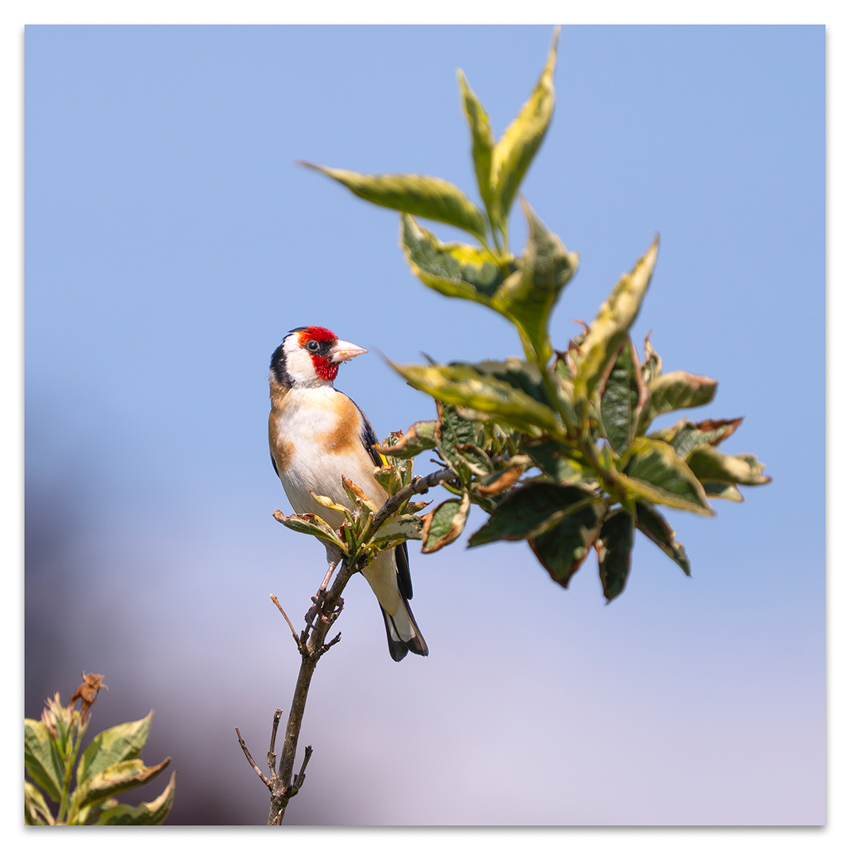
Bliss it was to be alive…
Wordsworth
So England marches on. An incredible victory in Mexico. Next stop the VIKINGS! With the goalmeister himself Erling Haaland. Of course he is playing for the wrong team. He was born in Leeds so is actually a Yorkshire Tyke. A lucky man which ever way you look at things.
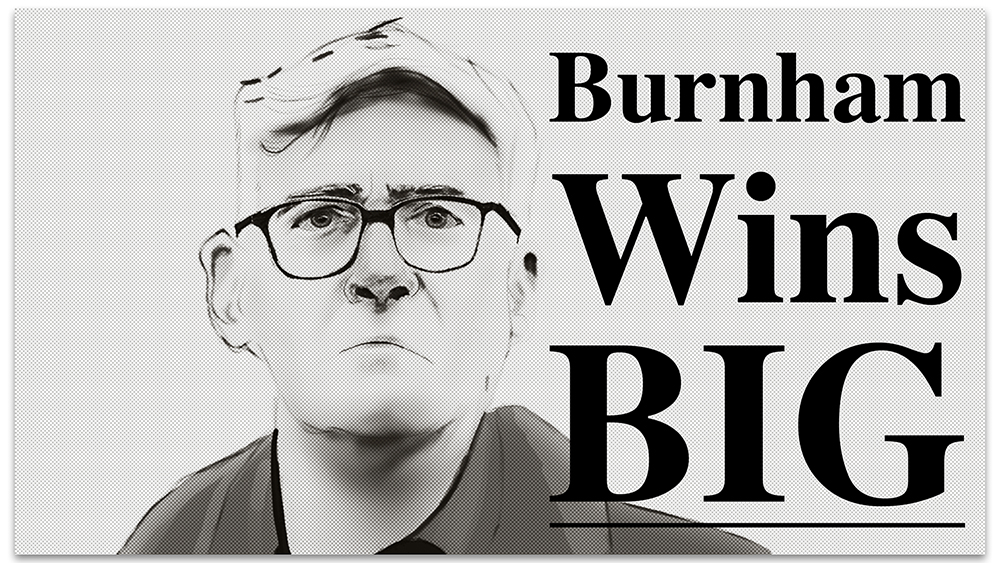
Talking of lucky men what about Andy Burnham? He is getting to take a victory lap before the first shot has even been fired in his presumptive Premiership. Now I have no idea what type of Prime Minister he will be. None. What I have seen so far is that he appears to have the ability to talk to people in a way that Sir Keir Starmer never could. This probably explains why he has got the boot because if was able to show a bit of personality then he might have been able sell the strong set of achievements the Labour Government has delivered. All against a backdrop of one of the biggest piles shit left by any government.
Which brings me to the talking heads. Boy have they been talking. And tutting. And Substacking. And casting grave fortunes. It would seem that they have decided that everything that Burnham might want to do is wrong. Just wrong.
Or maybe they have decided to follow the Daily Mail’s screaming headlines about how Burnham is leading a ‘ left wing coup’. Many are the same people, may I add, that were singing the praises of the election of Liz Truss. They know nothing.
And I know nothing other than if the presumptive Prime Minister does become the next actual Prime Minister then he will make mistakes. He will have to make U turns, cock ups and I suspect will have to break manifesto commitments. All Prime Ministers do. He may actually turn out to be good at the job. Or so so. Given the crop of leaders of the current parliamentary political parties he is better than the rest. (You can decide whether that is saying something about our political class)
Now that might be damning with faint praise. The one thing he will need is a lot of luck. Maybe his first might be England winning the world cup on the day before he becomes Prime Minister. If that were to happen then you can forget D:ream’s ‘ Things can only get better”. We’ll all be singing “Three Lions”. (Well unless you live in Wales, Scotland and Northern Ireland)
We can all dream just a little. I’m sure Andy Burnham is.
Foot Note
Both of the songs mentioned come from the mid 90’s. What omen does that foretell?