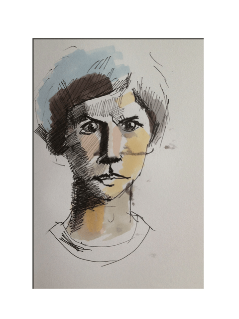
You really have to watch the spell check/ autocorrect on the iPad – I missed spelt angry and the wonderful system had replaced the word with A Grey. Anyway that would have made Scott Pilgrim VERY angry.
Sent from my iPad
You really have to watch the spell check/ autocorrect on the iPad – I missed spelt angry and the wonderful system had replaced the word with A Grey. Anyway that would have made Scott Pilgrim VERY angry.
Sent from my iPad
I love the film Mars Attacks and was watching that last night when I just had to draw this little sketch of the great Joe Dan Baker
Sent from my iPad
Another revelation….I have a much shorter attention span when trying to make a painting with Brushes than in the real world. I suppose this is a work in progress but I am now loosing interest with it, I suppose the main reason for that is … well I am not sure but I am now a little bored making this so I probably call it a day. The good thing is that it is significantly better than earlier attempts with brushes…I think???
Sent from my iPad
Another stab at Charles 1st – this time from a photo
Sent from my iPad
For those of you who do not know Compton Verney is a wonderful artistic gem set in the rolling south Warwickshire countryside. It was paid for by the millions earned from Football Pools and has wonderful permanent collection as well as world class visiting exhibitions and paintings. One of those paintings is the painting of King Charles 1st by Sir Anthony Van Dyke. I sat down and sketched two of the three heads and it was real privilege to have the time just to really study this fine painting. In fact it is more of a technical blue print than work of art as it was created so that an italian sculpture could make a bust of Charles.
Sent from my iPad
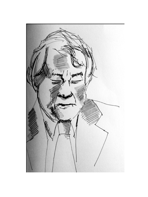
There are two things that I have come to appreciate when using pen and ink. The first is that you have to live with every mark you make – there is no going back. This, like most things, is not totally true but it has enough truth to mean that there is little opportunity to correct any mistakes and should you try it may well end in the destruction of the thing you were trying to create in the first place.
The second thing is that Tone is king and how you attempt to introduce tone into the drawing is key to making the drawing a success – this, of course, is true to much figurative work but I feel it is doubly so when you only have two true tones, black and the colour of paper. To overcome this I have introduced a third element – my trusted Letraset promarkers. Here I am able to use shades of grey to enhance the tones provided by the pen. I think it works quite well.Sent from my iPad
Yesterday I had a major pen problem. For some reason I got something on my hand that I then got on to one of my pens which caused an allergic reaction. The result of this is that I threw all my pens away. In hindsight this was an over reaction but there we are. Anyway, I had to get some new pens to draw with so I am currently woking out how to best use a set of Faber Castel pens. This little sketch of John Sargeant is one of my first attempts.
Sent from my iPad